Friday, May 28, 2010

Fix-it Friday #56


This week's editing challenge was particularly difficult for me, not because it needs so much work, but rather, because it doesn't need much at all. A little cropping and a bit of brightening was about all I could envision. I did take it a step further and smoothed out some of the rash on the skin and I cloned out the diapers and a foot that I found a tad distracting. In the end, the skin colors weren't just right yet, so I overlayed a skin-colored texture that brightened it up and gave it more natural coloring.

Here is the before image


Here is the edited version


To see other edits of this image, go here

Friday, May 21, 2010

Fixit Friday #55


Here we are again. This week's challenge involved an adorable photo that was taken in poor light. First, I imported it into Lightroom where I adjusted the color balance, exposure, tinting, hues, saturation and shades and cropping. Then I transferred it to Photoshop where I worked on reducing the noise, sharpening the image and placing several textures on it.

Here is the BEFORE image,


And here is the AFTER,


To see other editing ideas go to I Heart Faces

Monday, May 17, 2010

I Heart Faces

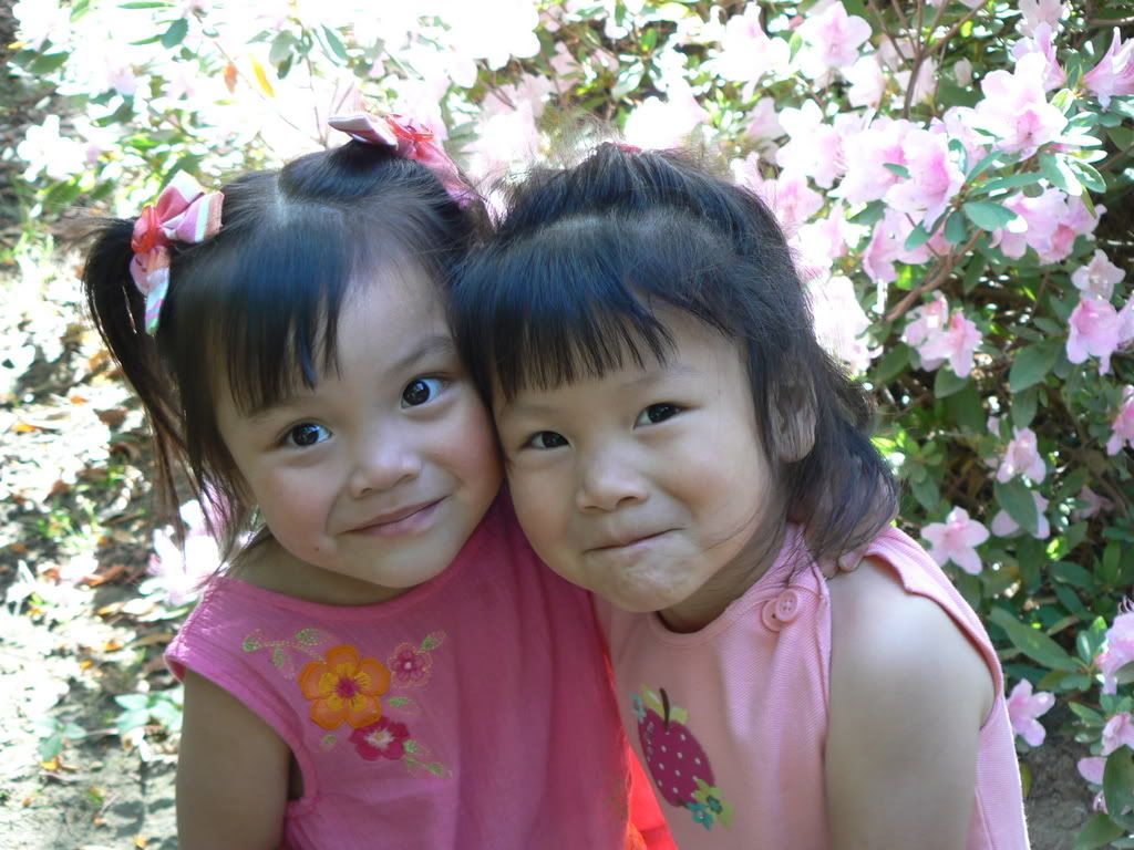
This week's theme at I Heart Faces is "Faces and Flowers".


I don't usually get a chance to enter, but I had just taken a suitable picture the week before that was perfect for this challenge. This is my daughter Chloe enjoying some beautiful flowers that she picked from our yard.


To see other entries, go to I Heart Faces

Sunday, May 16, 2010

Another Photo Shoot


Well, I keep doing this and I seem to be enjoying it. I have a strong desire to learn more and improve my skills. I keep striving for that illusive perfect picture (which I haven't found yet). This weekend, some friends asked if I would take their pictures and I was actually eager to say "yes". When I first accepted a request a few months ago, I was nervous and scared. Now, I am much more comfortable.

Yesterday's session was as challenging as any. I find myself so busy trying to capture every moment, that I don't always think about natural poses and trying to get enough pictures of each group. This time, I forgot to get pictures of just the mom and dad together. They are a wonderful and loving couple. It was just me who wasn't thinking through the entire process.

Here are a few shots from yesterday.


Friday, May 14, 2010

Fix-It Friday #54


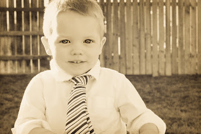
Here is today's image. I did the majority of the editing in Lightroom. Then I opened the image in CS4 to sharpen the eyes just a tad and to remove the food off the face. I also smoothed the colored image a bit. I used three textures on the B/W image to give it an "aged" look.

One other trick I usually employ when I am working on these pictures is to artificially enlarge the image. Photoshop does a great job of enlarging a small image and keeping the pixels sharp.


BEFORE


AFTER


Click on the images for a larger view. To see other fantastic edits, hop on over to I Heart Faces.

Friday, May 7, 2010

Fixit Friday #53

Click on any image for a larger view.


ORIGINAL

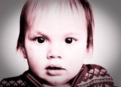
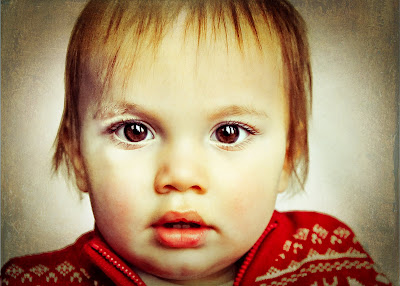
For the sake of a better location, I am posting my edits to I Heart Faces "Fix It Friday" here on my design blog. Since I have no new designs (yet), I guess this is the most logical place to work on my photo editing skills. This week's photo over at I Heart Faces is a sweet close-up. I love these because there is so much that can be done with the eyes. First I cleaned up the stray spots (looks like food or boo boos) on the face and then I used curves in Photoshop CS4 to lighten the left side of the face. I used a mask to keep the right side unaltered. I pretty much use masks and layers on all my edits.

I transported the image back and forth between Photoshop and Lightroom. I have a preset that I designed in Lightroom that I call "Purplelicious". I knew it would work well with this image. It gives the image some muddy and purple tones. After that, I placed a couple of textures on the image to add interest and depth to the background. These layers created a vignette to the image that highlights the center and fades away the background. Lastly, I forgot to mention that I enhanced the resolution and cropped the image before doing anything else. When I am almost done, I lighten and sharpen the eyes for extra impact. Here are my edits.
AFTER IN COLOR
AFTER IN BLACK AND WHITE